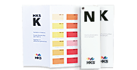
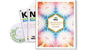


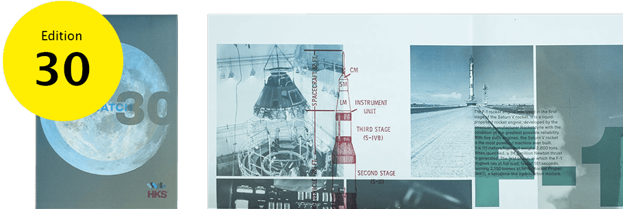
Warenzeichenverband e.V
® = trademarks of HKS Warenzeichenverband e.V. with companies:
hubergroup Deutschland GmbH, Flint CPS Inks Germany GmbH, H. Schmincke & Co. GmbH & Co. KG
Credentials
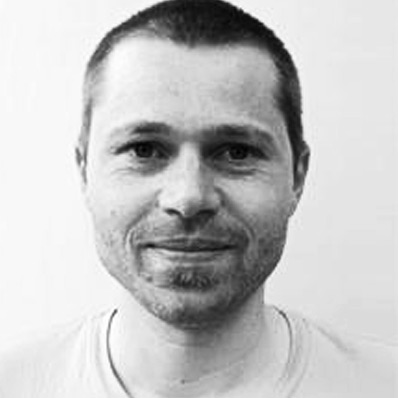
LARS HARMSEN
Lars Harmsen trained as a lithographer.
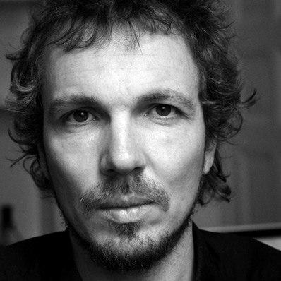
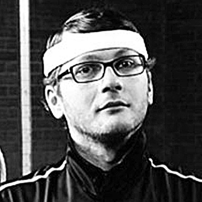
CLEMENS HARTMANN
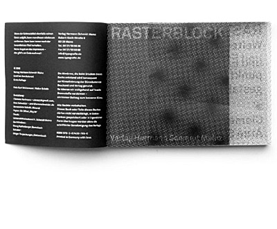
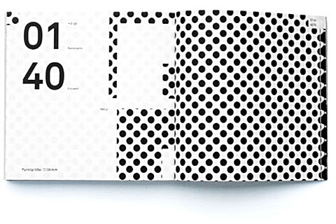
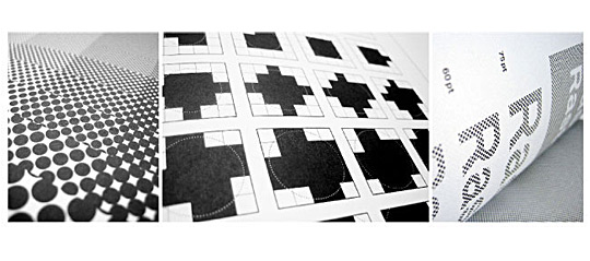
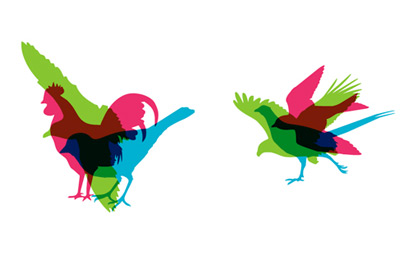
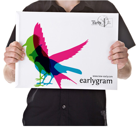
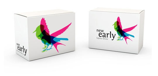
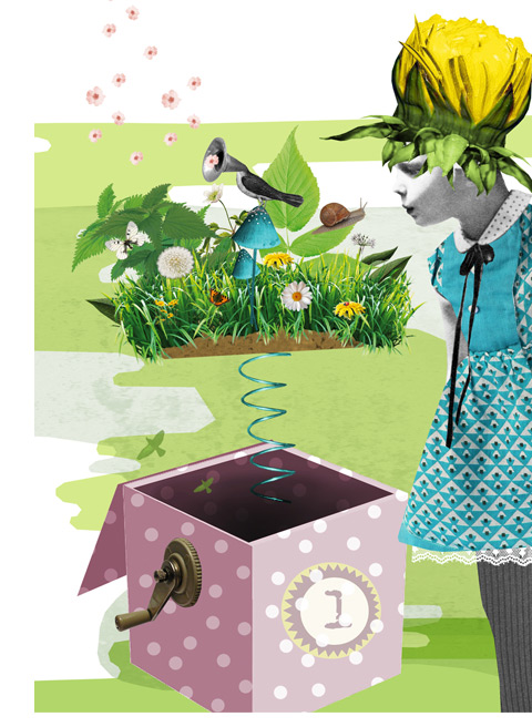
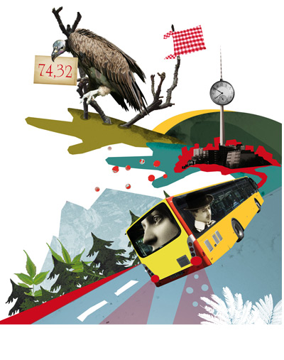
Clemens Hartmann gives us an exclusive peek at this season’s gem.
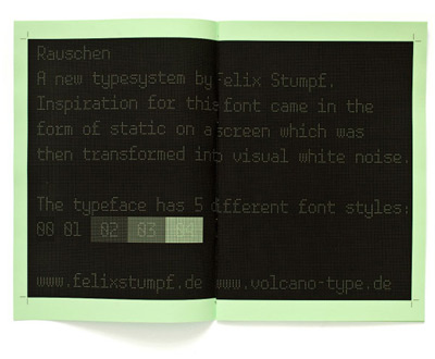
FELIX STUMPF
Felix Stumpf was born in Stuttgart, Germany.
PETER BRUGGER
Peter Brugger completed his training at a screen and offset printer’s.
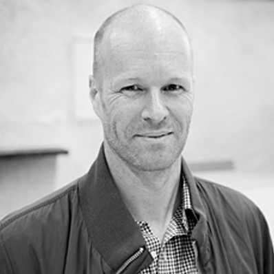
MARKUS KREYKENBOHM
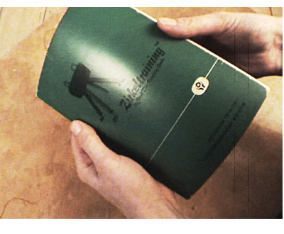
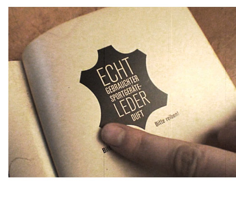
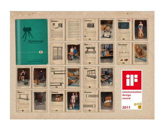
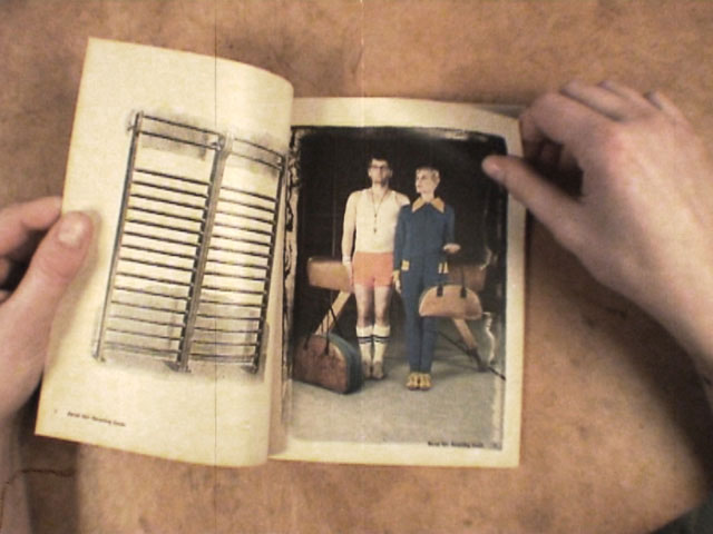
Zirkeltraining product catalogue
THOMAS PRUSS
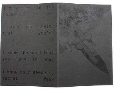
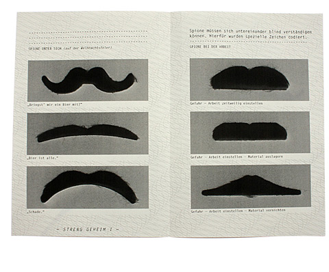
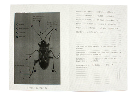
The HANDBUCH FÜR SPIONE
HANNES VON DÖHREN
A german designer
BRITTA SIEGMUND
A german designer
THOMAS GLÖWING
A german designer from cologne.
CINDY SCHMID
Cindy Schmid, a.k.a. swinx
In 1995, he founded the Karlsruhe agency MAGMA Brand Design together with Ulrich Weiss.
Created in collaboration with Arne Schneider.
He studied visual communication within the school of design at pforzheim university.
He studied visual communication in many countries over the world.
Only one person makes bags out of recycled athletic-equipment leather and gym mats: father of gymnastics, Bernd Dörr.
offers survival tactics and tricks of the trade for would-be secret agents?
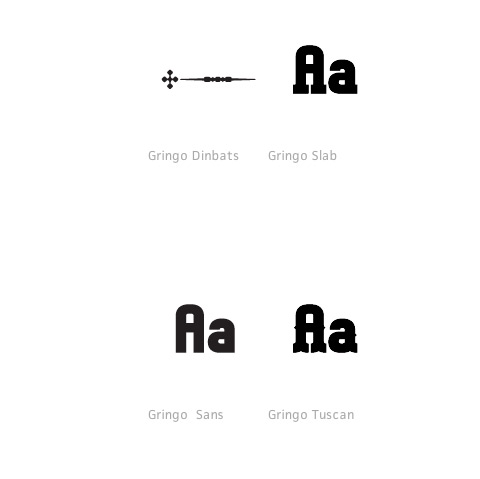
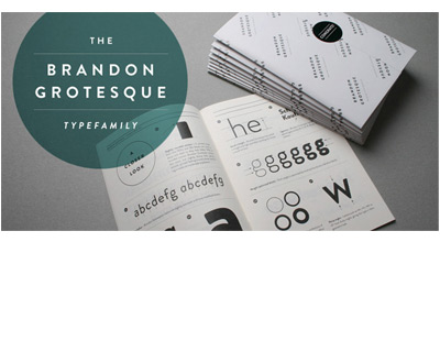
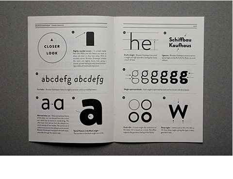
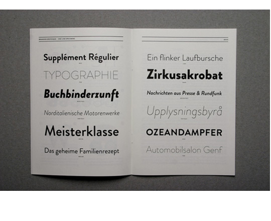
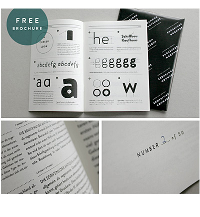
Font talent at its best, professional typography.
The chains of habit are generally too weak to be felt until they are too strong to be broken.” – Samuel Johnson.
Brand development, corporate design, naming and logo development competition.
Works as a freelance graphic designer/illustrator and artist.
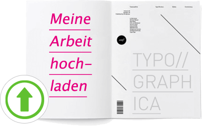
THERE IS STILL ROOM FOR YOU!
Just uploading a convincing work.
Upon successful application you will get your work presented here and also the »Creative
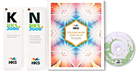
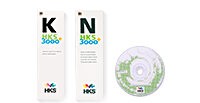
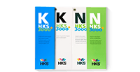
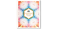
Box HKS 3ooo+« worth 200€.